I’d like to make a new template, but I’m a bit over my head on the spreadsheet mechanics of how to do some of this.
My goal is to create a template worksheet that helps me analyze year-over-year for specific categories of stuff I’d call “volatile,” or where our spending can vary greatly month-to-month, for up to about 5 years of stuff. I’ve found this really helpful when it comes to looking at utility data so I have a good sense of whether our usage is actually going up as well as our costs.
I have a sheet set up where I’m manually inputting my month-to-month spending on those “volatile” categories right now, and that charts out subseqent years compared to 2024 (when I started with Tiller). It’s super helpful and it shows me and my wife clearly where we’re spending a lot suddenly, especially if we’re substantially over budget (monthly and year-to-date).
I’d like to be able to automate some of this to pull from transactions and budget information and build it into a template that maybe other people can also use; in part because I want to give back to the community a bit, and in part because I think if I can actually understand how this works, I think I have several other use cases for it both in Tiller and outside of it that would make my life a ton easier.
The data I want is in the Transactions and Categories sheets, and I know there’s a bunch of community templates that gather this and break it down. I just don’t really know how it gets there.
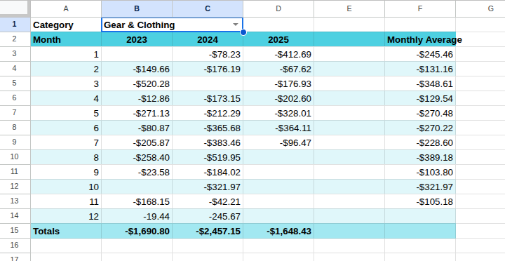
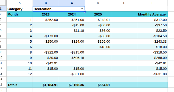
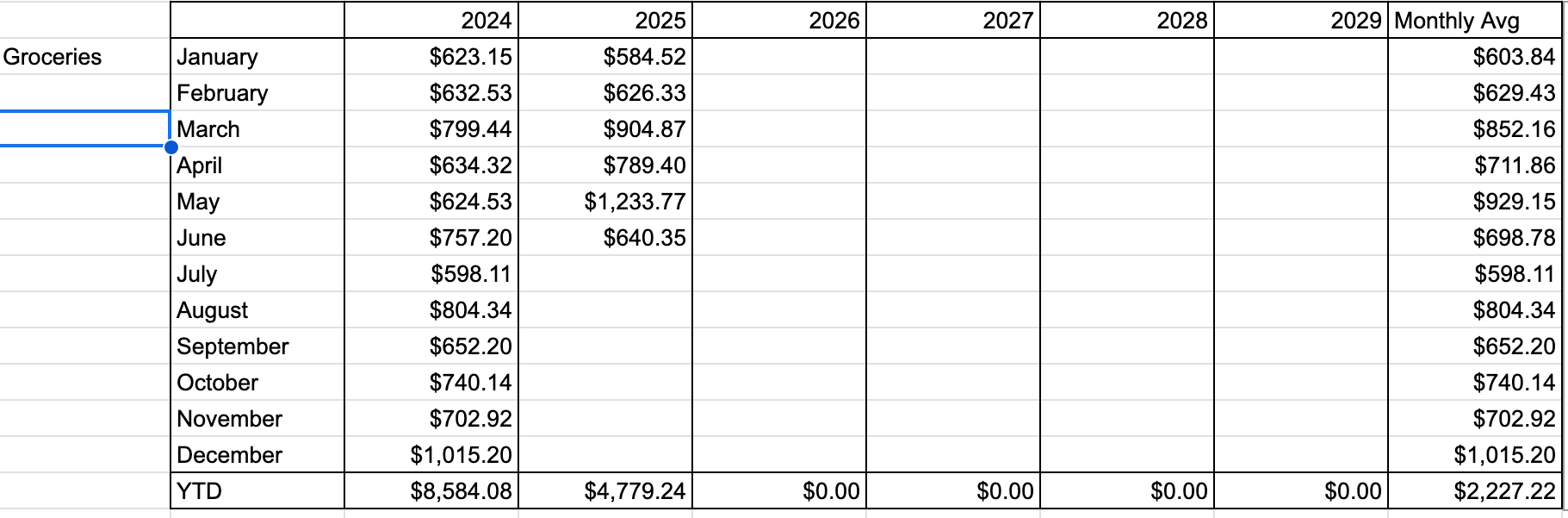
The template I want to make would pull say 60 months of category actual spending data from a user-specified start month to to a dynamically updating table of some sort as transactions come in, and then filter that into an addtional table that pulls just from a category sorts it and displays it by year and month, like this:
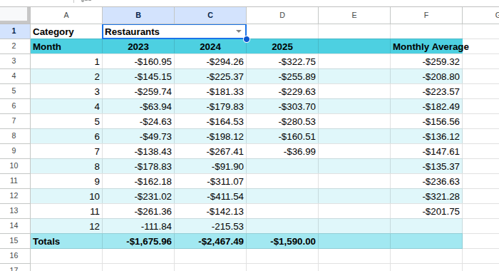
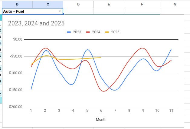
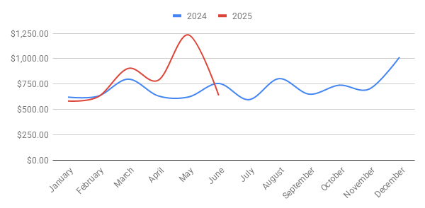
That can then be used to generate a chart like this:
I have no idea how to get the table to start on the user-specified month (if someone’s fiscal year runs say starting in July or October or something) and then flow 12 months consecutively, or how to get it to sort the Transaction data by category over those 60 months and separate it into years and then months.
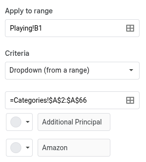
I looked at the Budget Builder community template as an example, which shows me the actuals monthly for every category for a particular time period, but I can’t understand how the Query function is being used there to generate the table it creates. I’ve been trying to wrap my head around the Query function, but I’m not really succeeding. Same with how the general helper data to create a list of the user’s categories works.
I’m afraid what I’m probably asking for here is an entire college course on spreadsheet function or data science, but is anyone willing to explain to me how all of this gets set up? Or is there some documentation somewhere that helps walk me through how to create this helper data and category breakdown stuff?
A heartfelt thanks in advance for anyone patient enough to teach me this. My spreadsheet knowledge is at best the level of a talented amateur, but I am very willing to learn.